Capsule Labels: Difference between revisions
m 4 revisions imported |
m 7 revisions imported |
(No difference)
| |
Revision as of 09:18, 5 December 2024
 |
More Citations Needed! This page needs citations! Relevant discussion may be found on the Talk page. You can improve this article by adding citations to reliable sources.
Incomplete Page! This page is incomplete! The author might still be writing it, or there are TODO markers around, indicating some work to be done.
Starfleet Capsule Labels, sometimes also erroneously referred to as "Okudagrams" or Bubble Labels are pieces of set-dressing found across ships from the TNG-era of Star Trek franchise shows. They were originally designed by Mike Okuda. Appearing since Season One of Star Trek: The Next Generation, capsule labels are a way of "greebling" a set to give it more detail than it otherwise might have. They can be found on sets, usually on access panels and doors, but they can also be found on props; examples include the back of PADDs, Starfleet equipment cases, LCARS Consoles, and Starfleet containers.
From afar, they appear to either have technobabble phrases adorning them, but in reality, most capsule labels from the SD-era shows (before Enterprise) will usually show either random numbers (extremely rare after Season 1 of TNG) or more commonly, a technobabble phrase followed by a humorous in-joke or gag. These can range from catchphrases of 90s cartoons to quotes from old poems or song lyrics. The whole point was to fill space, and in the pre-HD era, since most of these weren't readable, it was acceptable to fill space with nonsense. In the words of Mike Okuda, "They were intended to be unintelligible, but were obviously very important."[1]
By the HD-era of Enterprise, capsule labels were recycled for squared-off labels, now with a no-nonsense policy. More technobabble and less fun quotes were utilized.
Description
Capsule labels have taken on many different variations over the years. For the purposes of this article, labels will be organized based on size. There are too many variations to describe for each size type, so instead, this article will describe the most common types, and variants will be discussed in another section.
Between all labels, 6 colors are almost exclusively used: Red, Brown, and Blue, and the inverse of the three (some print the text with the color, others print the negative space around the text with the color.) The color of the paper seems to dictate what show it was made for; TNG and early DS9 used glossy white paper, VOY used silver metallic paper, and FC through NEM used gold metallic paper. Gold labels do appear briefly in VOY, during the episode "Life Line" which largely takes place on Jupiter Station, a new set from a post-DS9 era. All metallic variations have a brushed finish to them, however there are some early examples that used a solid gold/silver metallic paper. The colors don't seem to dictate specific function; however, extrapolation seems to reveal Red being used for warnings, Brown used for general information, and Blue being used for all other uses.
Note: It appears that early examples of FC/VOY capsule labels might have featured a brushless foil. A set of brushless gold labels was previously sold at auction, and while the quality leaves a bit to be desired, during an on-set tour by Garret Wang, a blue-text capsule label with brushless silver foil is shown.
Starting with the smallest of the pack, there are the Extra-Small labels. These are most commonly found on small devices, such as PADDs or Desktop Displays. They feature a single numeric.
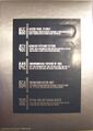
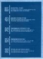
The Small label is the most common label, found on set pieces, props, containers, etc. These have dimensions of 4.25" by 1". These feature a large, 3-digit number on the left side. On the right side, a single bold title line with a numeric code and a label can be found. Below that, a small warning or informative sentence can be found, followed by an in-joke or quote.
Medium labels were spotted being used on FC onward. They are much longer than the small labels, and feature 3 lines of filler rather than two. They also feature two titles rather than just one.
Large Labels are rectangular in shape, and are more detailed, as they're actually able to be seen on most SD-era scenes. Because of this, they will usually lack the quotes or technobabble, and will just feature random numbers. Notably, they read something along the lines of "Starfleet Materiel" which is a military term to describe equipment for the military. These labels share a distinct design and can actually be found at different sizes, anywhere from 6 inches across to 15 or 20 inches. These are generally found on large containers.
Door labels are spotted around all of the major ships from the series. These are generally one-shots, denoting specific locations, such as specific character's quarters, or for rooms like the Mess Hall, The Bridge, or Turbolifts. They usually feature a split down the middle so that the door can open. This makes them extremely rare to find in an unused format. It's most likely that there wasn't a standard size for these. They also feature a special color not seen on other capsule labels: light purple. However, by the VOY/FC era, this color was replaced with the standard gold/silver foil.
Most labels were printed using continuous form paper, designed to be fed through a dot-matrix or line printer. Notably, it seems as though the foil paper used for foil signs uses a very specific, 15-inch-long paper, as both small and large examples of foil labels come on 15-inch-long sheets.
History
Capsule labels were first seen on Star Trek: The Next Generation, seen adorning Starfleet ships. They were first seen as capsule-shaped labels, with a large 3-digit number on the left, a line separating part of the label, and a string of random numbers, usually in 3 lines. These capsules are notable for featuring some harsh corners, which are never seen again post-Season 2 of TNG.
From Season 3 onward, all capsules were beveled around the edges, and followed a very strict size convention for the small and medium stickers. This was most likely because they were cut to spec by computers, and thanks to this, all stickers come off of the a same standard sheet.
Commercially Available Replicas
On eBay, several high-quality replicas of these stickers can be found. However, none truly match the original stickers, and feature many distinct inaccuracies from font choice to spacing and sizing.
In May 1999, Mike Okuda, alongside Doug Drexler and Denise Okuda, published The Star Trek Sticker Book.[2] This book features the most accurate commercially available stickers and have a direct lineage to the original files used to produce them. However, considering that it's a commercial book, where the original stickers were printed by a professional sign maker, there are bound to be inaccuracies with color and printing detail. The stickers also don't feature the fun gags, possibly removed for copyright concerns, and have bene replaced with technobabble on both lines. Other capsule stickers are found in this book, but they are inaccurately sized in order to fit in the book.
In the 2010s, Mike Okuda released a short-run print of his capsule labels via manufacturer Bye Bye, Robot.[3] These were designed to closely match the original capsule labels from the show, and were printed in the standard white-on-brown color.They were available in two sets: one for devices, and one for locations/quarters. Surprisingly, as with the sticker book, these do not feature original text from the original set: instead of featuring technobabble, they are entirely joke phrases.
Known Label Text
- Main Article: Capsule Labels/Known Label Text
Images
-
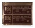
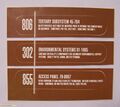 Small labels, TNG-era, in White-on-Brown.
 -
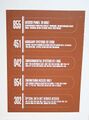 Small labels, TNG-era, in White-on-Brown.
 -
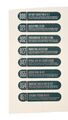
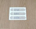
 Small labels, DS9/VOY era, in Blue-on-Silver.
 -
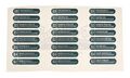
 Small labels, DS9/VOY era, in Silver-on-Blue.
 -
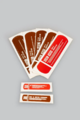
 A selection of the 3 colors for labels from the VOY and Film-era.
 -
 Small labels, VOY era, in Silver-on-Blue. Note the brushed silver going the wrong way (vertical instead of horizontal.)
 -
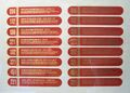
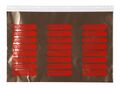 Small labels, Film-era, in Gold-on-Red.
 -
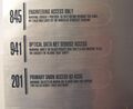
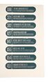
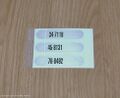
 Small labels, DS9/VOY era, in White-on-Brown.
 -
 Small labels, VOY-era, in Blue-on-Silver.
 -
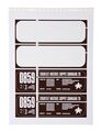
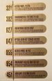
 Medium Materiel Label, Film-era, in Gold-on-Brown.
 -
 An auction photo featuring the rarely-seen S1 variants of the medium capsule labels.
 -
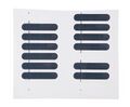
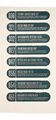
 VOY-era blue labels.
 -
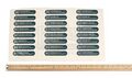 Ditto.
 -
 Ditto.
 -
 Ditto.
 -
 Ditto.
 -
 A rare sight; two capsule labels in the same frame, one showing the inverted design and color of the other.
 -
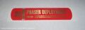 A variation on a capsule label, allegedly for phaser containers in the TNG Films.
 -
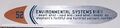 A rare variation on capsule labels, for the futuristic USS Relativity set for VOY.
 -
 Extra-Small Capsules, allegedly brown for TNG.
 -
 Extra-Small Capsules, silver for VOY.
 -
 Medium labels, Film-era, in Gold-on-Red.
 -
 Small Labels, Film-era, in Brown-on-Gold.
 -
 A rare sighting of a gold label in VOY, from the Alpha-Quadrant Jupiter Station in S6xE24.
 -
 Ditto
Ditto


